

Design System
This design system built to deliver clean, consistent, and scalable digital experiences. It brings together components, styles, and guidelines to simplify workflows and accelerate product development.
Client:
-
Date:
Type:
Landing Page
Role:
UI/UX Designer
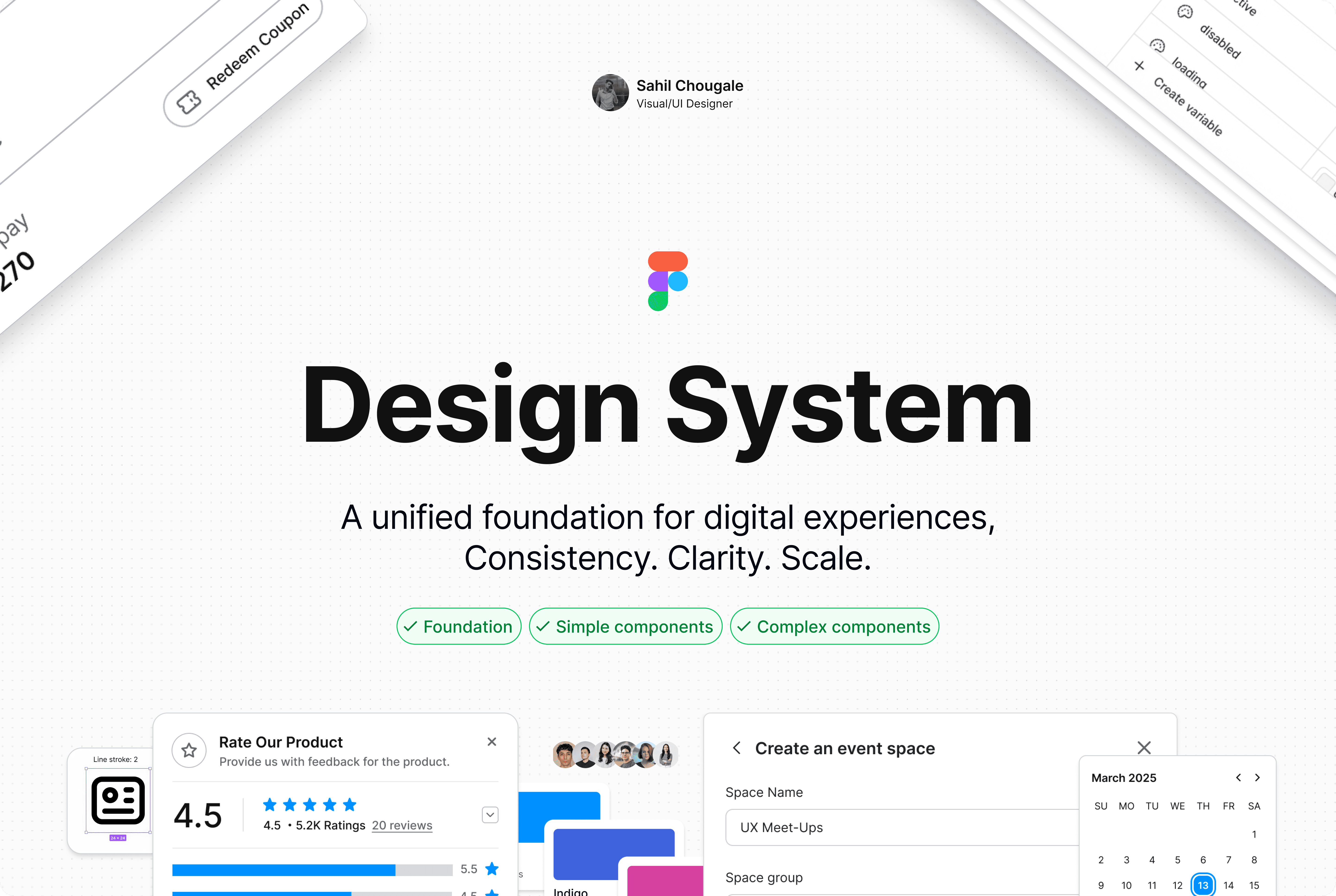
Design System
A scalable design system created to maintain visual consistency, improve usability, and accelerate product development across the platform.
Foundations
Defined a structured typography scale to establish clear visual hierarchy and readability across the interface.
Created a comprehensive color system including primary, secondary, neutral, and semantic colors for success, warning, and error states.
Implemented a grid and layout system to maintain alignment, spacing consistency, and responsive design.
Standardized spacing rules and layout structure to ensure balanced and predictable UI composition.
Core Components
Designed reusable UI components such as buttons, input fields, tables, cards, and form elements.
Defined multiple interaction states including hover, focus, active, and disabled states.
Standardized form components and validation patterns to improve data entry experience.
Created consistent data display patterns for tables and structured information.
Ensured components are modular, scalable, and easy to reuse across different screens.
Visual Elements
Developed a consistent icon system for navigation, actions, and feedback.
Standardized icon sizes and styles to maintain visual harmony across the interface.
Created structured UI patterns and layouts to improve clarity and usability.
Ensured all visual elements follow a unified design language.
Impact
Achieved a consistent user interface across the entire product.
Reduced design and development time using reusable components.
Improved collaboration between designers and developers through standardized guidelines.
Enabled scalable and faster product development for future features.


